
Streamlining Ground-Up Initiative's volunteer management system
Automating Hyundai's issue reporting with a mobile app
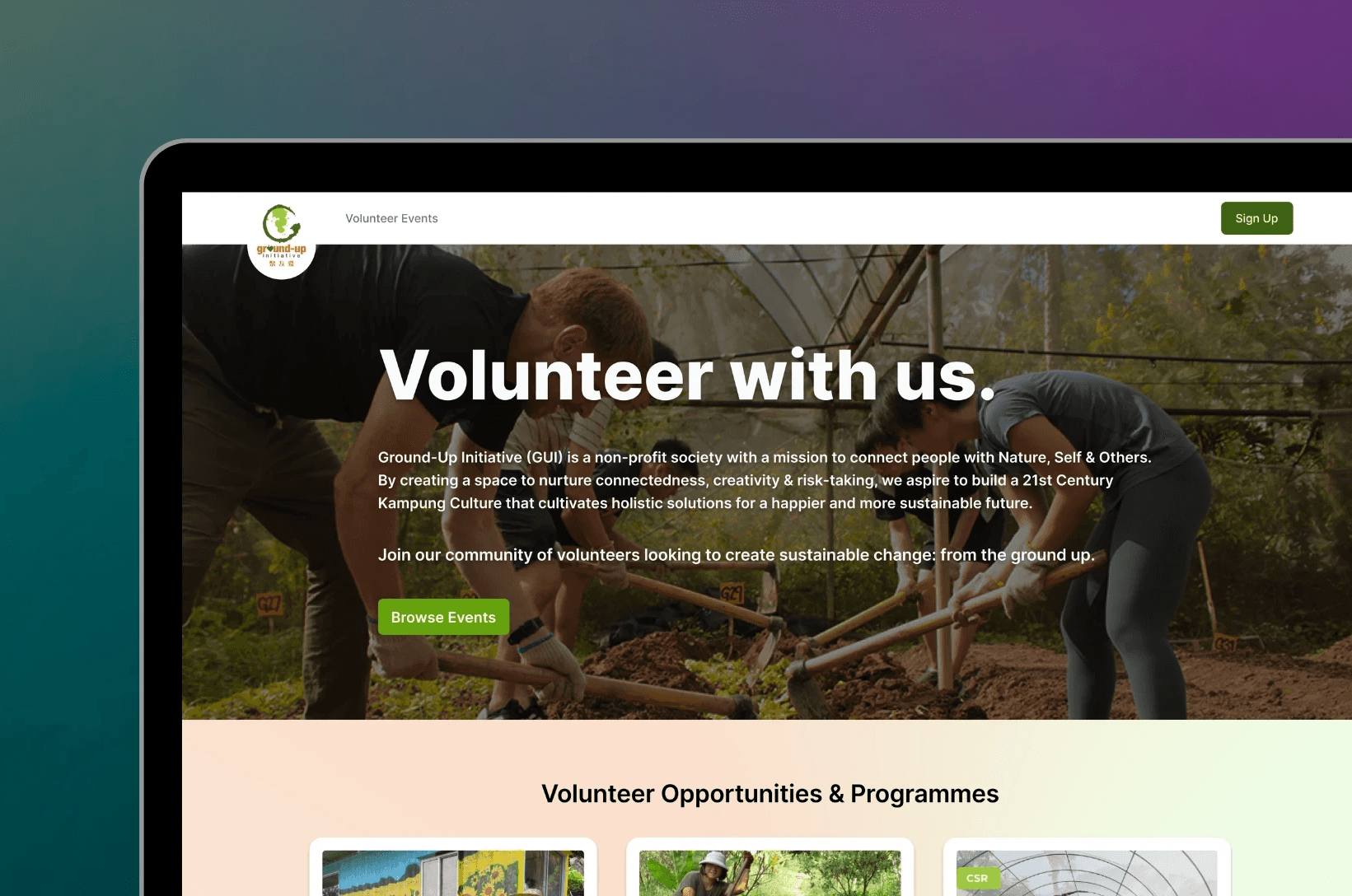
I designed the public-facing side of a volunteer management system, allowing GUI volunteers to seamlessly register for and manage events.
I designed the public-facing side of a volunteer management system, allowing GUI volunteers to seamlessly register for and manage events.
Seamless volunteer registration for workshops and events
Seamless volunteer registration for workshops and events
Ground-Up Initiative (GUI) is a client of GDSC NUS and an environmental NPO which runs ‘Kampung Kampus’ (Village Campus) workshops connecting the public and nature. Since 2008, GUI has engaged over ~50,000 volunteers with their events.
Ground-Up Initiative (GUI) is a client of GDSC NUS and an environmental NPO which runs ‘Kampung Kampus’ (Village Campus) workshops connecting the public and nature. Since 2008, GUI has engaged over ~50,000 volunteers with their events.
Our project team aimed to design and implement a volunteer management system to reduce the manual labor of the admin staff.
Our project team aimed to design and implement a volunteer management system to reduce the manual labor of the admin staff.
Duration
Duration
Sep 2023 - Apr 2024
Sep 2023 - Apr 2024
Skills
Skills
Design Thinking, Flow Mapping, Wireframing, Interface Design
Design Thinking, Flow Mapping, Wireframing, Interface Design
Team
Team
4 UI/UX Designers working alongside product and tech teams
4 UI/UX Designers working alongside product and tech teams
Our solution: A robust volunteer management system!
Our solution: A robust volunteer management system!
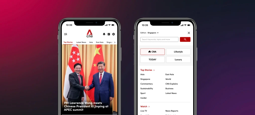
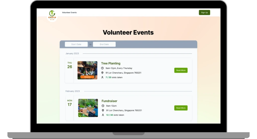
I designed the public-facing website to allow GUI volunteers to browse all events, register for events and view bookings linked to their accounts.
I designed the public-facing website to allow GUI volunteers to browse all events, register for events and view bookings linked to their accounts.
View Opportunities
View Opportunities

Browse and Register for Events
Browse and Register for Events
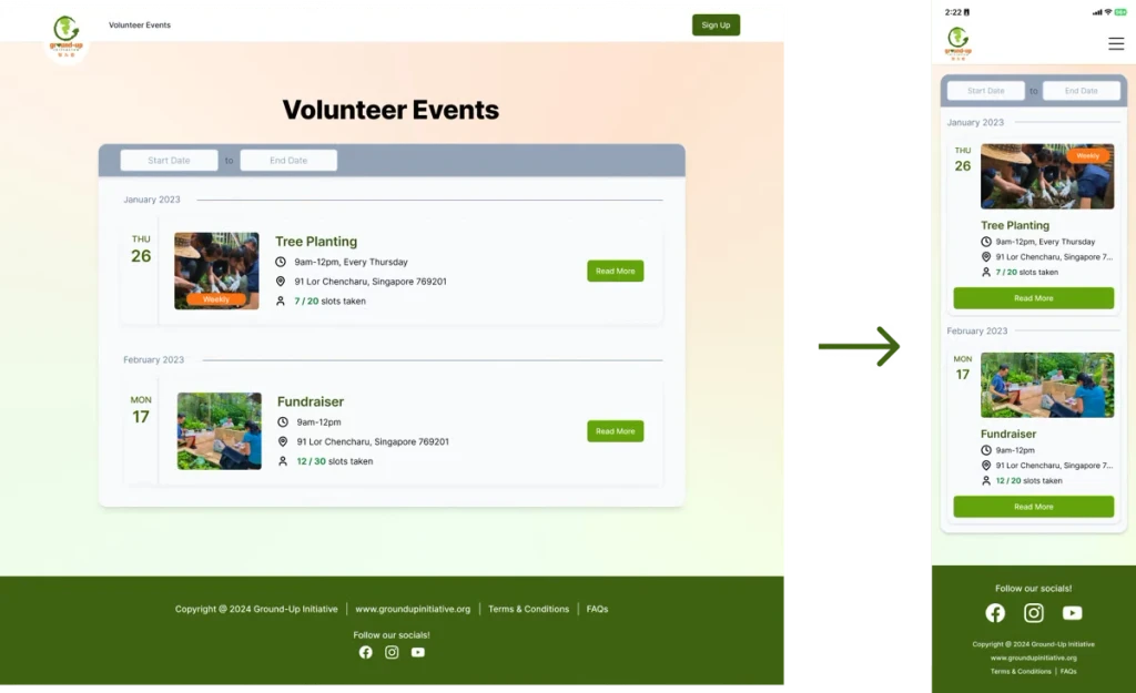
Mobile-Friendly, Too!
Mobile-Friendly, Too!

#1: Define the problem
#1: Define the problem
What's the problem with the current workflow?
What's the problem with the current workflow?
😡 Manual and Tedious
😡 Attendance Updates
😡 Attendance Updates
Volunteer attendance is updated manually by one admin using screenshots sent via WhatsApp.
Volunteer attendance is updated manually by one admin using screenshots sent via WhatsApp.
😡 Reliance on WhatsApp
😡 Volunteer Identification
😡 Volunteer Identification
Admin has to manually identify whether the volunteers are first-time or regulars.
Admin has to manually identify whether the volunteers are first-time or regulars.
😡 Reliance on WhatsApp
😡 Volunteer Registration
😡 Volunteer Registration
Volunteers register via Google Forms, and the data is manually transferred into Excel.
Volunteers register via Google Forms, and the data is manually transferred into Excel.
Who are our target users?
Who are our target users?
The Production Issue Tracking project team defined two key groups of target users:
The Production Issue Tracking project team defined two key groups of target users:
GUI Admin Staff who manage the volunteers and event registration. Currently, there is only one admin managing all the volunteers manually.
GUI Admin Staff who manage the volunteers and event registration. Currently, there is only one admin managing all the volunteers manually.
Volunteers who are environmentally-conscious members of the public (all ages) that sign up for GUI events.
Volunteers who are environmentally-conscious members of the public (all ages) that sign up for GUI events.
#2: Conduct some research
#2: Conduct some research
Let's interview users…
Let's interview users…
From interviewing both Production Technicians and PICs, we got to understand their key motivations and pain points. [Click tabs to toggle! ✧]
From interviewing both Production Technicians and PICs, we got to understand their key motivations and pain points. [Click tabs to toggle! ✧]
GUI Admins
Volunteers
Motivations
Want to avoid manual data scraping and entry of volunteer info into Excel
Want to focus on higher-level managerial tasks
Pain Points
A lot of manual and tedious effort for a sole admin staff
GUI Admins
Volunteers
Motivations
Want to avoid manual data scraping and entry of volunteer info into Excel
Want to focus on higher-level managerial tasks
Pain Points
A lot of manual and tedious effort for a sole admin staff
GUI Admins
Volunteers
Motivations
Want to avoid manual data scraping and entry of volunteer info into Excel
Want to focus on higher-level managerial tasks
Pain Points
A lot of manual and tedious effort for a sole admin staff
…and analyze competitors
…and analyze competitors
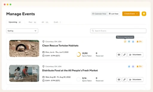
We analyzed the features of two volunteer management system specialist providers that provide services for multiple non-profit clients.
We analyzed the features of two volunteer management system specialist providers that provide services for multiple non-profit clients.
☝️ POINT
☝️ POINT
We liked the minimalist interface, data visualization and volunteer gifts/certificates.
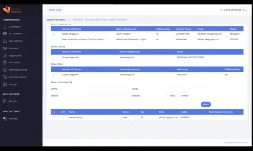
Admin: Able to create, edit and manage ongoing events. Data visualization to show impact statistics, able to export to Excel.
Volunteers: Able to create an account to log volunteering activity. QR scan for volunteers to self-check-in. Volunteers can receive participation certificates.
We liked the minimalist interface, data visualization and volunteer gifts/certificates.
Admin: Able to create, edit and manage ongoing events. Data visualization to show impact statistics, able to export to Excel.
Volunteers: Able to create an account to log volunteering activity. QR scan for volunteers to self-check-in. Volunteers can receive participation certificates.
🌀 Givlly
🌀 Givlly
We found the VC function irrelevant, but liked the basic functions and centralized app.
Admin: Able to set recruitment quotas, assign roles and venues, auto-create schedules, track volunteering hours and gather feedback.
Volunteers: Able to self-register for events, update profile, check volunteering hours and receive notifications.
#3: Ideate and design
#3: Ideate and design
#4: Get feedback and iterate
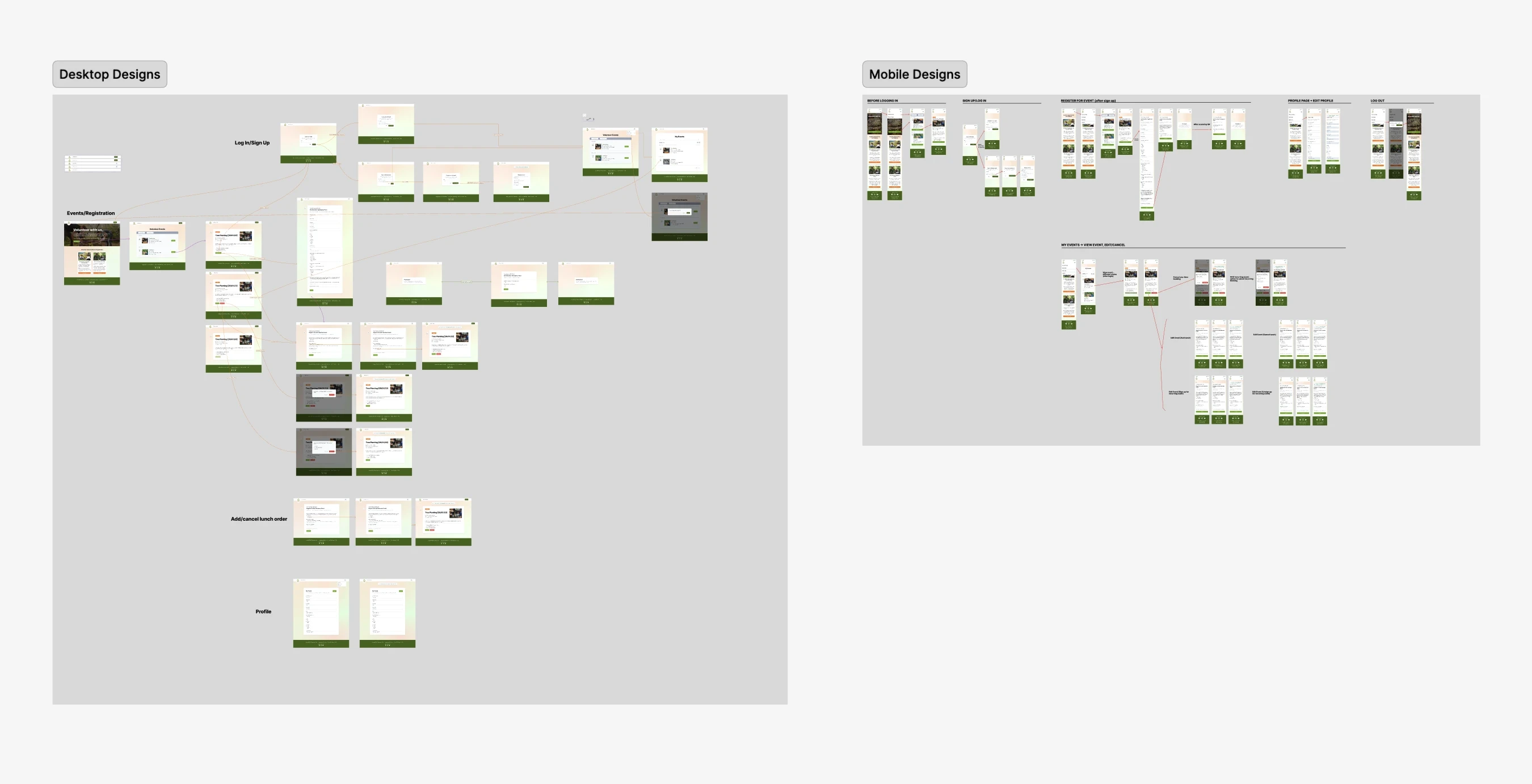
Visualizing user flows
Visualizing user flows
In our new flows, volunteers will be able to self-register for events, receive automated onboarding messages and track QR attendance on the public-facing website. On the admin-facing side, the admin can create and manage events, view volunteer details and generate volunteer attendance reports.
In our new flows, volunteers will be able to self-register for events, receive automated onboarding messages and track QR attendance on the public-facing website. On the admin-facing side, the admin can create and manage events, view volunteer details and generate volunteer attendance reports.
As the sole designer for the public-facing site, the primary users I considered were the volunteers.
As the sole designer for the public-facing site, the primary users I considered were the volunteers.
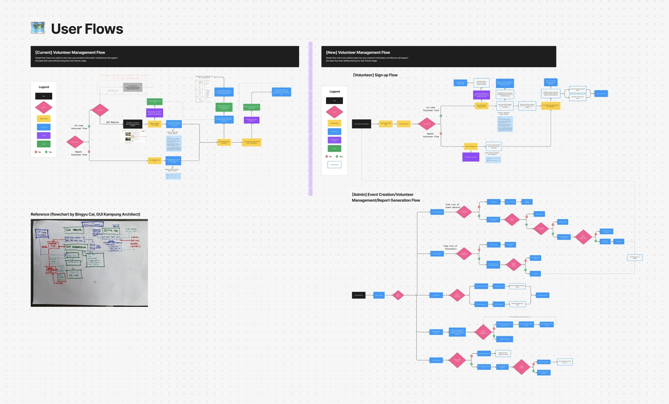
View Figma file: User Flows
View Figma file: User Flows
Wireframing
Wireframing
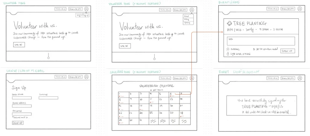
Most visitors of the GUI website access via desktop, so I began with desktop-first designs. I drew up initial sketches of the lo-fi wireframes for the desktop screen before transferring them to Figma.
Most visitors of the GUI website access via desktop, so I began with desktop-first designs. I drew up initial sketches of the lo-fi wireframes for the desktop screen before transferring them to Figma.
Creating hi-fi designs
Creating hi-fi designs
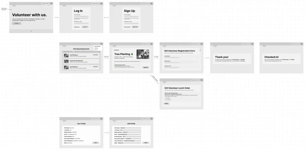
I did up high-fidelity designs for a responsive desktop and mobile site, adopting a desktop-first approach since most volunteers use desktop to access the GUI main site. When adapting the designs for mobile, I had to take into account the smaller screen, vertically-aligned and touch-based interface, increasing the size of primary buttons for thumb-friendly design.
I did up high-fidelity designs for a responsive desktop and mobile site, adopting a desktop-first approach since most volunteers use desktop to access the GUI main site. When adapting the designs for mobile, I had to take into account the smaller screen, vertically-aligned and touch-based interface, increasing the size of primary buttons for thumb-friendly design.
#5: Arrive at a final design!
#4: Get feedback and iterate
Syncing up internally
Syncing up internally
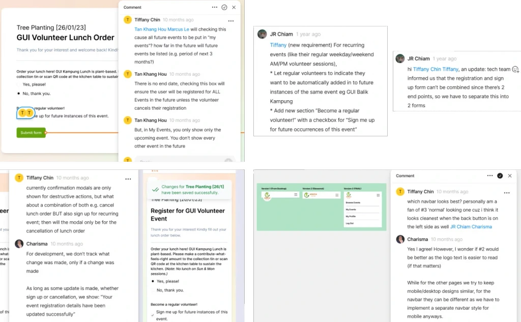
Throughout the design process, we obtained internal feedback from tech and product teams which I used to iterate and improve upon the designs. In these sync-up sessions and comments, we were able to clarify any points of confusion between the teams. Furthermore, as the team heads had biweekly catch-ups with the GUI staff, they relayed client feedback to us designers.
Throughout the design process, we obtained internal feedback from tech and product teams which I used to iterate and improve upon the designs. In these sync-up sessions and comments, we were able to clarify any points of confusion between the teams. Furthermore, as the team heads had biweekly catch-ups with the GUI staff, they relayed client feedback to us designers.
Conducting usability tests
Conducting usability tests
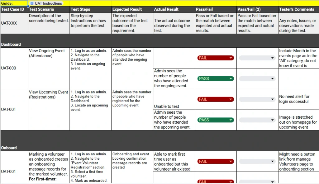
We recruited members of the public (’volunteers’) and GUI admin to perform different test cases and documented the expected and actual results, alongside any issues found.
We recruited members of the public (’volunteers’) and GUI admin to perform different test cases and documented the expected and actual results, alongside any issues found.
Objective: Validate that the new solution is intuitive for users to complete the user flow in a clear, straightforward manner by asking them to complete a series of tasks (test cases).
Objective: Validate that the new solution is intuitive for users to complete the user flow in a clear, straightforward manner by asking them to complete a series of tasks (test cases).
👥 Usability Test Findings
👥 Usability Test Findings
For the public-facing website:
Users felt that the iconographic background of the landing page was distracting from the task of browsing events and filling the volunteer onboarding form
Users struggled to complete the edit events flow as the dropdown menu appeared hidden
Users did not see the success toast messages after cancelling an event and so were confused as to the system status
Users would like to know the number of remaining vacancies for each event
Users would like help documentation or tooltips for additional guidance
Acting on feedback
Acting on feedback
Landing Page
Cancel Event
Mobile Navbar
Design Decision 1: Improved Landing Page
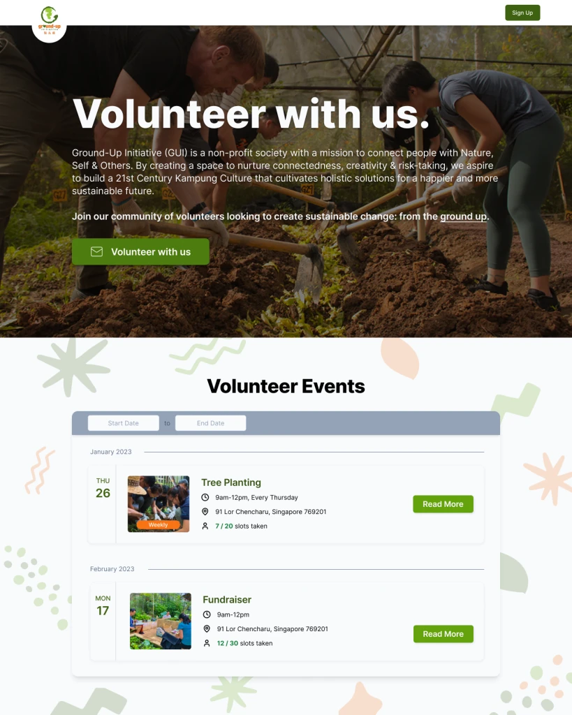
❌ Distracting graphics background
❌ “Volunteer with us” CTA does not clearly indicate the action performed by clicking
❌ Unable to display the Events preview on the landing page due to technical constraints
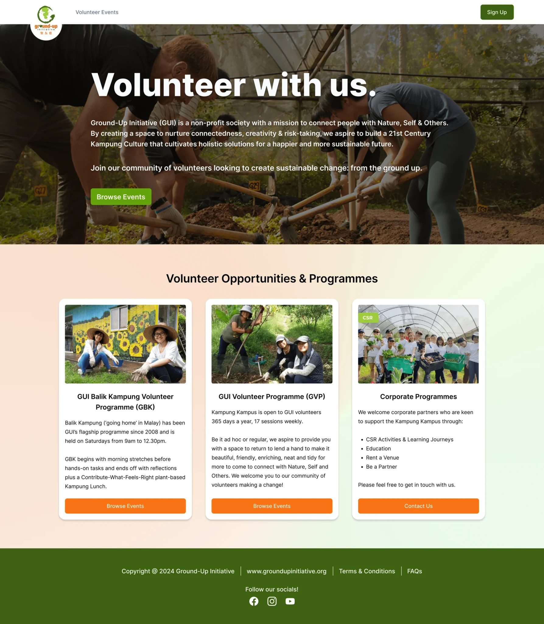
✅ Cleaner gradient background
✅ Changed to “Browse Events” CTA
✅ Replaced Events preview with Volunteer Opportunities to overcome tech issues and integrate with main GUI website
Landing Page
Cancel Event
Mobile Navbar
Design Decision 1: Improved Landing Page
❌ Distracting graphics background
❌ “Volunteer with us” CTA does not clearly indicate the action performed by clicking
❌ Unable to display the Events preview on the landing page due to technical constraints
✅ Cleaner gradient background
✅ Changed to “Browse Events” CTA
✅ Replaced Events preview with Volunteer Opportunities to overcome tech issues and integrate with main GUI website
#5: Arrive at a final design!
#6: Let's reflect…
Finally, some hi-fi designs…
Finally, some hi-fi designs…
After acting on the feedback from our internal sync-ups and usability testing, I finalized the high-fidelity designs before hand-off to the developers in the tech team.
After acting on the feedback from our internal sync-ups and usability testing, I finalized the high-fidelity designs before hand-off to the developers in the tech team.
View Figma file: Hi-Fi Designs
View Figma file: Hi-Fi Designs
…and a final prototype!
…and a final prototype!
#6: Let's reflect…
Parting takeaways
Parting takeaways
Working on the public-facing desktop and mobile volunteer management system, I had some key takeaways from the product design process.
Working on the public-facing desktop and mobile volunteer management system, I had some key takeaways from the product design process.
If I were to be part of this project again, I would have conducted more comprehensive user research, such as longer interviews with users or quantitative surveys with GUI’s existing volunteer base. I would also work with the designers of the admin-facing site to incorporate “volunteer certificates” as badges of appreciation for GUI volunteers, which we identified as a bonus from competitor research but did not implement.
If I were to be part of this project again, I would have conducted more comprehensive user research, such as longer interviews with users or quantitative surveys with GUI’s existing volunteer base. I would also work with the designers of the admin-facing site to incorporate “volunteer certificates” as badges of appreciation for GUI volunteers, which we identified as a bonus from competitor research but did not implement.
🗣️ Communicate frequently
🗣️ Communicate frequently
Sync-up frequently with internal teams and the client to align the product scope and features. We want to avoid redoing aspects of the project.
Sync-up frequently with internal teams and the client to align the product scope and features. We want to avoid redoing aspects of the project.
💻 Designing different devices
💻 Designing different devices
Take note of mobile and desktop conventions when adapting designs. The device you design for first should be justified with user behavior.
Take note of mobile and desktop conventions when adapting designs. The device you design for first should be justified with user behavior.
💨 Design fast and get feedback
💨 Design fast and get feedback
While lo-fi wireframes are crucial, hi-fi designs can be prioritized to produce proof-of-concepts. Getting feedback fast > ‘perfecting’ designs.
While lo-fi wireframes are crucial, hi-fi designs can be prioritized to produce proof-of-concepts. Getting feedback fast > ‘perfecting’ designs.