
Improving CNA's page discovery with revamped mobile navigation menus
Improving CNA's page discovery with revamped mobile navigation menus
As a UX Intern at Mediacorp, I worked on the mobile navigation menus for the CNA revamp: from competitor analysis to prototyping to conducting a usability study.
As a UX Intern at Mediacorp, I worked on the mobile navigation menus for the CNA revamp: from competitor analysis to prototyping to conducting a usability study.
Seamless page navigation on mobile app and web
Seamless page navigation on mobile app and web
CNA is one of the most popular news platforms in Singapore and APAC with over 50 million monthly impressions across its digital products. It is owned by Mediacorp, a state-owned media conglomerate.
CNA is one of the most popular news platforms in Singapore and APAC with over 50 million monthly impressions across its digital products. It is owned by Mediacorp, a state-owned media conglomerate.
Our design revamp aimed to improve the user experience of the CNA home page, navigation menus, and ‘Lifestyle’ and ‘Listen’ sections. I worked on the menus as an internship project.
Our design revamp aimed to improve the user experience of the CNA home page, navigation menus, and ‘Lifestyle’ and ‘Listen’ sections. I worked on the menus as an internship project.
Duration
Duration
Oct - Dec 2024
Oct - Dec 2024
Skills
Skills
Product Thinking, User Research, Usability Study Planning, App Design
Product Thinking, User Research, Usability Study Planning, App Design
Team
Team
1 UX Design Intern, 2 Senior UX Designers, 2 UI Designers, 2 Product Managers
1 UX Design Intern, 2 Senior UX Designers, 2 UI Designers, 2 Product Managers
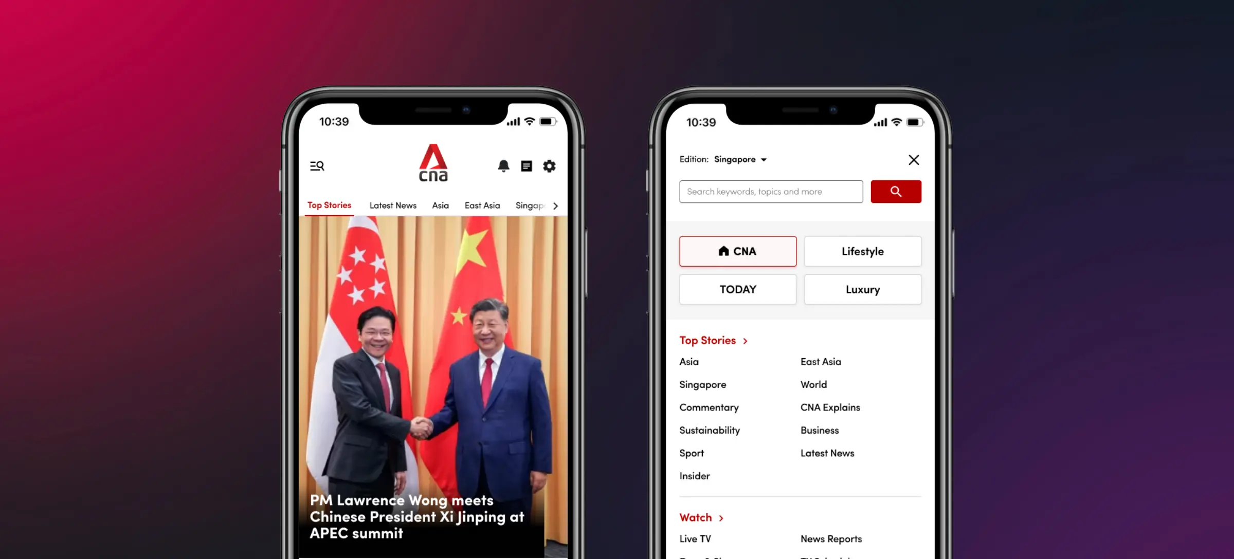
Our solution: Revamped navbar and side menu!
Our solution: Revamped navbar and side menu!
I worked on the navigation menus (hamburger side menu and top navbar menu) to allow users to conveniently navigate between the main CNA sub-pages: Home ↔ Lifestyle ↔ TODAY ↔ Luxury. This would boost page discovery, potential ad revenue and allow users to navigate more intuitively.
I worked on the navigation menus (hamburger side menu and top navbar menu) to allow users to conveniently navigate between the main CNA sub-pages: Home ↔ Lifestyle ↔ TODAY ↔ Luxury. This would boost page discovery, potential ad revenue and allow users to navigate more intuitively.
From our usability study results, my revamped navigation menus were received well by 88% of users, reducing time taken to navigate the platforms by 40%.
From our usability study results, my revamped navigation menus were received well by 88% of users, reducing time taken to navigate the platforms by 40%.
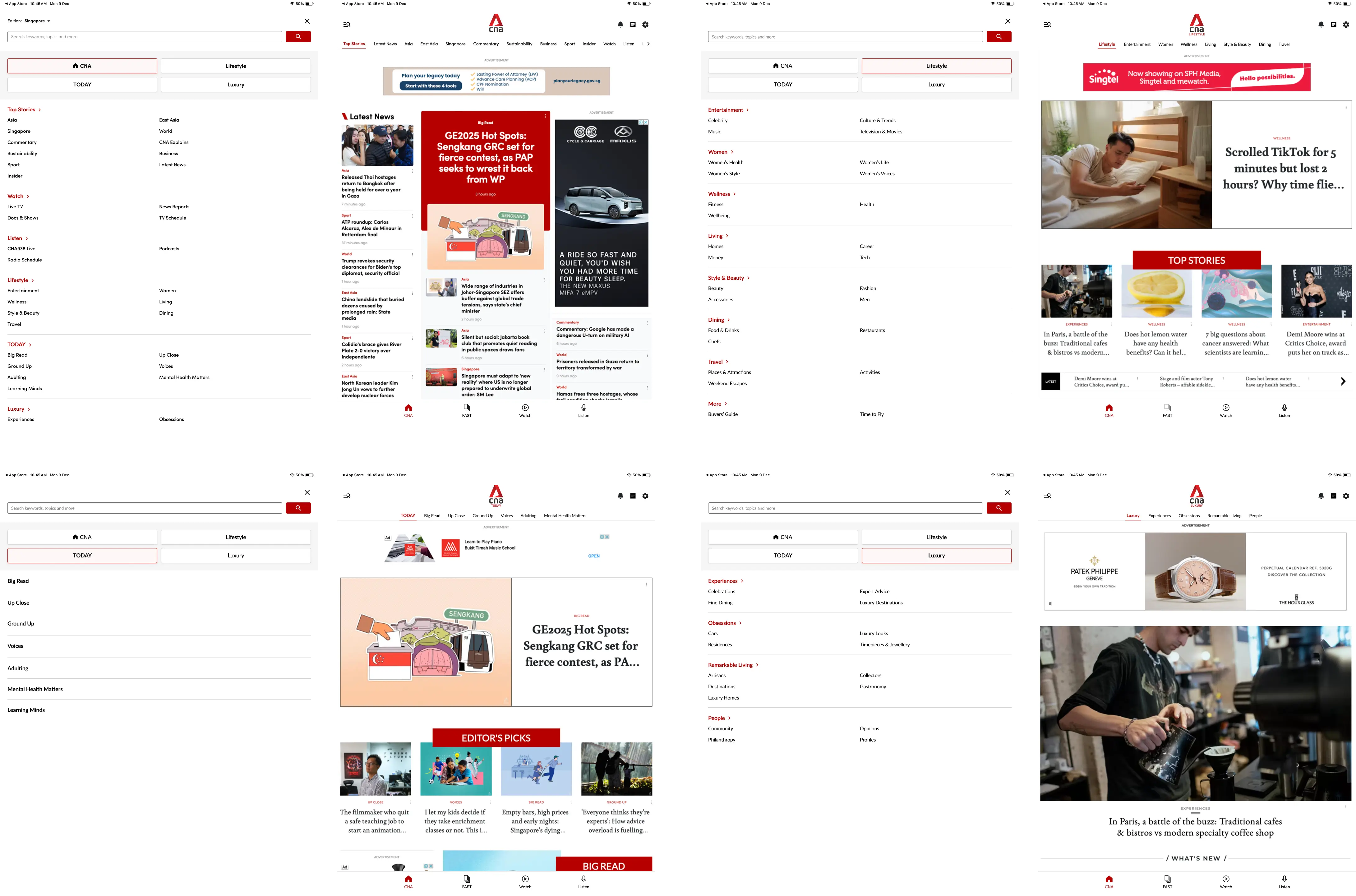
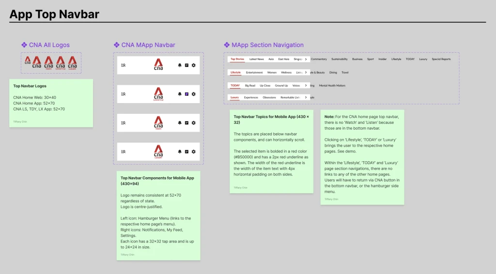
Intuitive Hamburger Menu
Intuitive Hamburger Menu
Users can easily toggle the side hamburger menu to access all news content, view sub-pages and return back to the main Home page.
Users can easily toggle the side hamburger menu to access all news content, view sub-pages and return back to the main Home page.
Convenient Top Navbar Menu
Convenient Top Navbar Menu
Besides the hamburger menu, users can also scroll through the horizontal section navigation in the top navbar to access all pages.
Besides the hamburger menu, users can also scroll through the horizontal section navigation in the top navbar to access all pages.
#1: Define the problem
#1: Define the problem
What's the problem?
What's the problem?
Our initial user survey, which received 300+ responses, discovered that users found navigating between CNA sub-pages to be confusing, non-intuitive and lengthy.
Our initial user survey, which received 300+ responses, discovered that users found navigating between CNA sub-pages to be confusing, non-intuitive and lengthy.
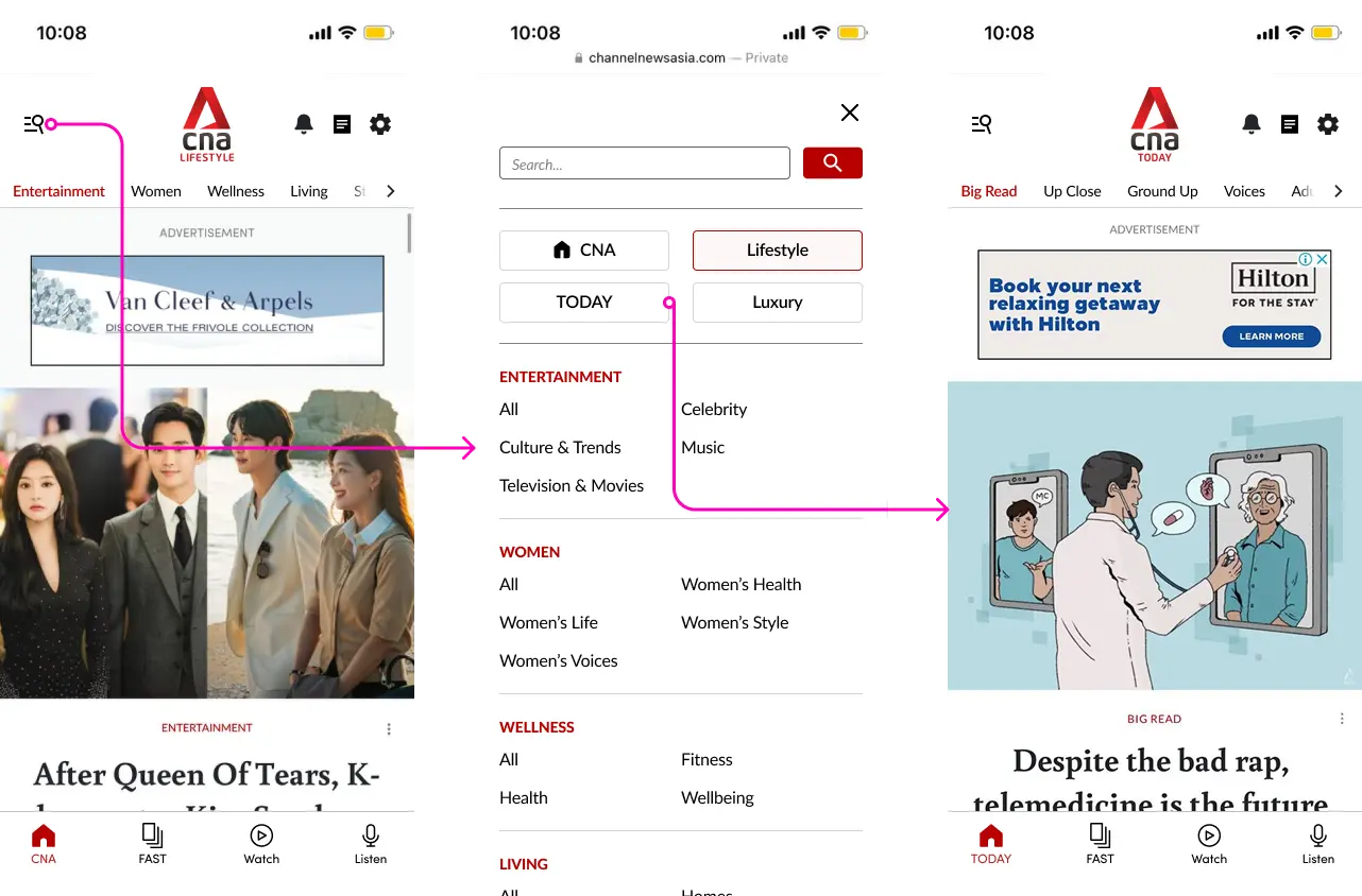
Below is the as-is menu navigation flow for the CNA app with the main user pain points.
Below is the as-is menu navigation flow for the CNA app with the main user pain points.
As-Is Flow: Navigating from CNA Home to CNA Lifestyle
As-Is Flow: Navigating from CNA Home to CNA Lifestyle
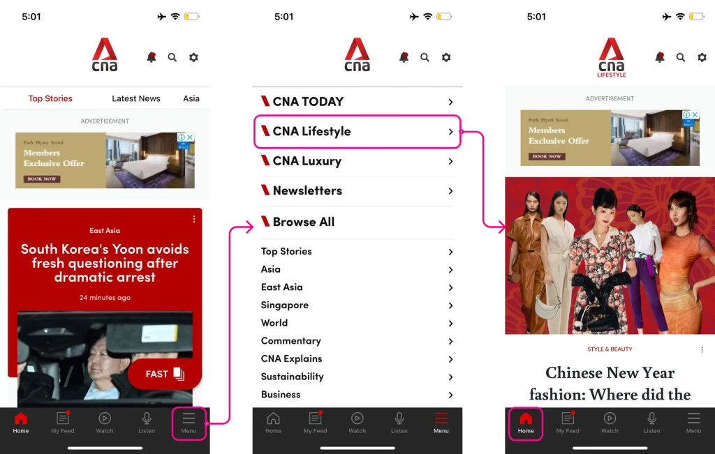
❌ To navigate to Lifestyle, users must use the bottom menu tab, as the Lifestyle page is not present in the top navbar.
❌ To navigate to Lifestyle, users must use the bottom menu tab, as the Lifestyle page is not present in the top navbar.
❌ The menu tab for navigation is not visible enough due to the position and lack of color contrast: the location is non-intuitive.
❌ The menu tab for navigation is not visible enough due to the position and lack of color contrast: the location is non-intuitive.
❌ After navigating to Lifestyle, it becomes the new Home tab, confusing users on how to return back to Home.
❌ After navigating to Lifestyle, it becomes the new Home tab, confusing users on how to return back to Home.
Who are our target users?
Who are our target users?
We focused on adult users who use CNA digital products at least once a week.
We focused on adult users who use CNA digital products at least once a week.
We decided to focus on more dedicated users (as opposed to casual browsers) since they would be more inclined to want to navigate through the site and be familiar with the ‘Lifestyle’ and ‘Listen’ pages. Furthermore, we might also get more detailed feedback from such users.
We decided to focus on more dedicated users (as opposed to casual browsers) since they would be more inclined to want to navigate through the site and be familiar with the ‘Lifestyle’ and ‘Listen’ pages. Furthermore, we might also get more detailed feedback from such users.
#2: Conduct some research
#2: Conduct some research
Let's survey users…
Let's survey users…
We conducted 2 surveys: an initial feedback survey and a usability study recruitment form.
We conducted 2 surveys: an initial feedback survey and a usability study recruitment form.
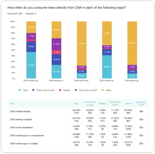
For the initial survey, our team used Zoho to create the survey which received 295 user responses. Our objective was to obtain user feedback on existing CNA digital products, identify and address challenges, and uncover usage patterns and user demographics.
For the initial survey, our team used Zoho to create the survey which received 295 user responses. Our objective was to obtain user feedback on existing CNA digital products, identify and address challenges, and uncover usage patterns and user demographics.
One key insight was that the majority of users surveyed use the CNA mobile website (46%) or mobile app (41%) compared to the desktop version (24%). Thus, we took a mobile-first direction for the design revamp!
One key insight was that the majority of users surveyed use the CNA mobile website (46%) or mobile app (41%) compared to the desktop version (24%). Thus, we took a mobile-first direction for the design revamp!
From this, we also received qualitative feedback on improvements users would like to see on CNA digital products, providing design insights. We sorted the 295 responses using affinity mapping into groups, such as ‘Ads’, ‘Article Reading’ and ‘Homepage’.
From this, we also received qualitative feedback on improvements users would like to see on CNA digital products, providing design insights. We sorted the 295 responses using affinity mapping into groups, such as ‘Ads’, ‘Article Reading’ and ‘Homepage’.
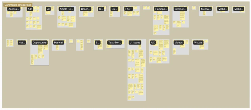
For the usability study recruitment form, we used Votigo to create the survey which received 476 user responses from social media. This time, our objective was to recruit participants for our usability study for us to test our revamped prototypes with users face-to-face. Again, we grouped user feedback via affinity mapping, which was really useful to identify specific feedback about the navigation user experience.
For the usability study recruitment form, we used Votigo to create the survey which received 476 user responses from social media. This time, our objective was to recruit participants for our usability study for us to test our revamped prototypes with users face-to-face. Again, we grouped user feedback via affinity mapping, which was really useful to identify specific feedback about the navigation user experience.

From our survey findings, I was able to better understand users’ pain points and motivations to shape my revamp of the navigation menus.
From our survey findings, I was able to better understand users’ pain points and motivations to shape my revamp of the navigation menus.
Motivations
Motivations
Want to quickly and conveniently move between sub-pages with minimal clicks, including a quick shortcut to return to the CNA homepage.
Want to quickly and conveniently move between sub-pages with minimal clicks, including a quick shortcut to return to the CNA homepage.
Want to easily and intuitively locate the navigation menu and search function.
Want to easily and intuitively locate the navigation menu and search function.
Want to view all navigation content regardless of menu position (e.g. all sub-pages should be accessible from both the top and bottom navbar menus).
Want to view all navigation content regardless of menu position (e.g. all sub-pages should be accessible from both the top and bottom navbar menus).
Pain Points
Pain Points
Menus are poorly organized and items are limited in visibility, making it difficult for users to locate desired pages or explore new content.
Menus are poorly organized and items are limited in visibility, making it difficult for users to locate desired pages or explore new content.
Disparities between different menus create confusion and frustration.
Disparities between different menus create confusion and frustration.
And interpret heatmaps…
And interpret heatmaps…
We also obtained heatmap data from Microsoft Clarity, which revealed the percentage of users that drop off after a particular scroll depth and the click percentage of the menu items. We found that 80% of users do not scroll beyond 25-30% of the page depth, and therefore, homepage content should be optimized within that space.
We also obtained heatmap data from Microsoft Clarity, which revealed the percentage of users that drop off after a particular scroll depth and the click percentage of the menu items. We found that 80% of users do not scroll beyond 25-30% of the page depth, and therefore, homepage content should be optimized within that space.
Also, more users clicked on the top navbar (40%) compared to the bottom ‘Menu’ tab (23%). This implies that for the redesign, we should place the menu in the top bar to improve visibility.
Also, more users clicked on the top navbar (40%) compared to the bottom ‘Menu’ tab (23%). This implies that for the redesign, we should place the menu in the top bar to improve visibility.

And analyze competitors!
And analyze competitors!
I conducted competitor analysis into other mobile news platforms (New York Times, South China Morning Post, The Guardian, BBC) to look into how they designed the navigation menus.
I conducted competitor analysis into other mobile news platforms (New York Times, South China Morning Post, The Guardian, BBC) to look into how they designed the navigation menus.
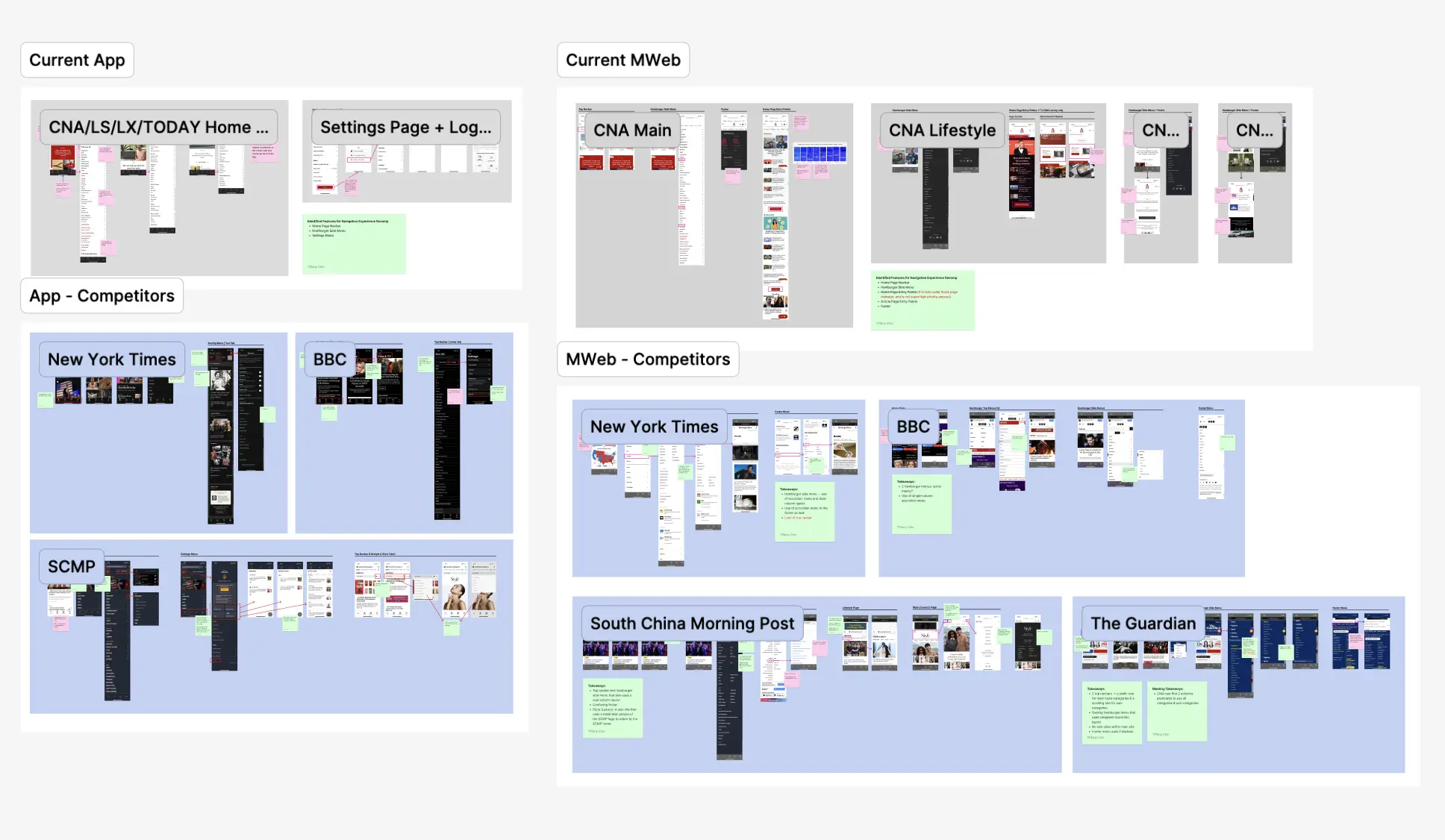
View Figma file: Menu Competitor Analysis
View Figma file: Menu Competitor Analysis
😁 What We Liked
😁 What We Liked
Moving the main navigation menu from the bottom to the top navbar (as a hamburger side menu with a nestled search function to browse all pages).
Moving the main navigation menu from the bottom to the top navbar (as a hamburger side menu with a nestled search function to browse all pages).
Dual-column layout within the hamburger menu in order to maximize screen real estate and reduce scrolling.
Dual-column layout within the hamburger menu in order to maximize screen real estate and reduce scrolling.
Bottom navbar being reserved for content only, such as ‘Home’, ‘Video’ and ‘Live’.
Bottom navbar being reserved for content only, such as ‘Home’, ‘Video’ and ‘Live’.
#3: Ideate and design
#3: Ideate and design
#4: Get feedback and iterate
What are the product requirements?
What are the product requirements?
Our design team frequently synced up with the CNA product managers to establish requirements and align the scope of the design revamp. While the senior designers worked on the home page and Lifestyle page revamps, I worked on the navigation menus.
Our design team frequently synced up with the CNA product managers to establish requirements and align the scope of the design revamp. While the senior designers worked on the home page and Lifestyle page revamps, I worked on the navigation menus.
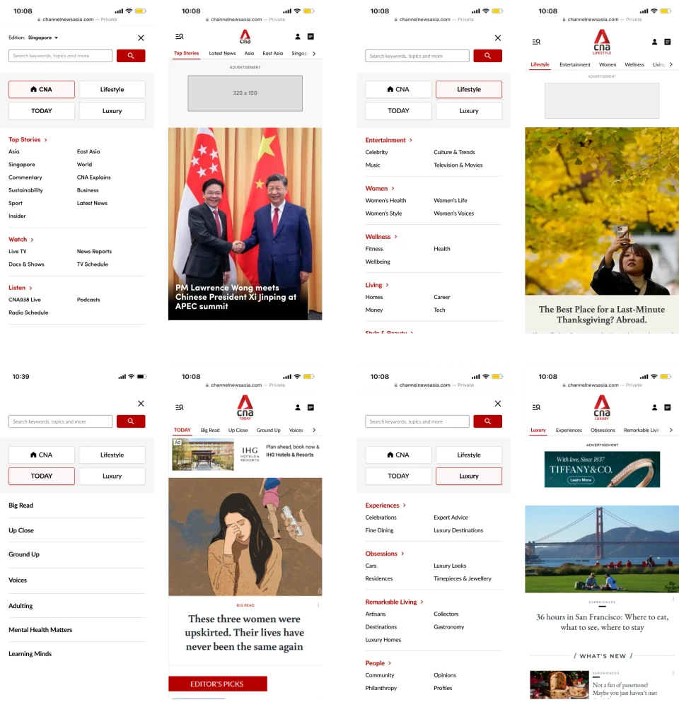
🗺️ Navigation Menus
🗺️ Navigation Menus
For users to conveniently and seamlessly navigate between CNA sub-pages and discover new page content.
For users to conveniently and seamlessly navigate between CNA sub-pages and discover new page content.
Consistent content across all menus regardless of user entry point.
Shortcuts to the main four sub-pages (CNA Home, Lifestyle, Luxury and TODAY) which will have their respective sub-menus.
Shortcuts to the different news sub-pages (CNA Home, FAST, Watch and Listen) with the existing floating FAST button being relocated into a menu.
Consistent content across all menus regardless of user entry point.
Shortcuts to the main four sub-pages (CNA Home, Lifestyle, Luxury and TODAY) which will have their respective sub-menus.
Shortcuts to the different news sub-pages (FAST, Watch and Listen) with the existing floating FAST button being relocated into a menu.
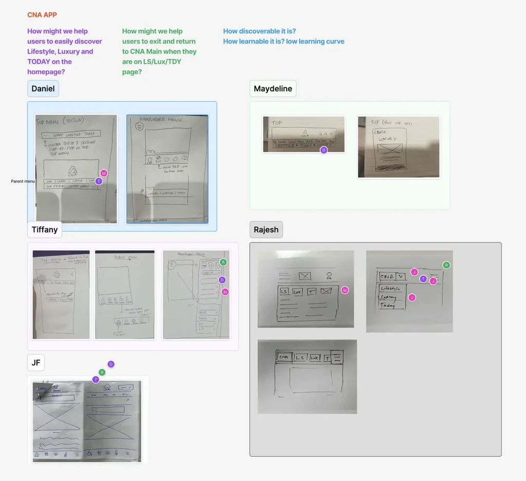
'Crazy 8s' ideation workshopping
'Crazy 8s' ideation workshopping
We conducted a 'Crazy 8s' design sprint workshop on FigJam as a way for our team to rapidly ideate mobile navigation menu designs. Each member was given eight minutes to produce rough sketches of how the menu might look like, and we reconvened as a team to vote on the designs we liked. The idea of a hamburger or drop-down menu was especially popular and I brought this forward in my subsequent designs!
We conducted a 'Crazy 8s' design sprint workshop on FigJam as a way for our team to rapidly ideate mobile navigation menu designs. Each member was given eight minutes to produce rough sketches of how the menu might look like, and we reconvened as a team to vote on the designs we liked. The idea of a hamburger or drop-down menu was especially popular and I brought this forward in my subsequent designs!
#5: Arrive at a final design!
#4: Get feedback and iterate
Feedback I: Internal
Feedback I: Internal
After reviewing my mid-fidelity designs with the product managers and head, I got some feedback which I acted upon to polish up the designs before testing with users.
After reviewing my mid-fidelity designs with the product managers and head, I got some feedback which I acted upon to polish up the designs before testing with users.
Top and Bottom Navbars
Hamburger Menu
Design Review 1: Top and Bottom Navbars
✅ Improved light mode color contrast compared to the existing design.
❌ Unclear where certain features, e.g. settings, have been moved to.
❌ You tab in the bottom navbar may confuse users as to its purpose.

✅ Combined search with the menu icon and added the bell, My Feed and settings icons as per existing design.
✅ Revised the bottom navbar to have only the key news features, removing You.
Top and Bottom Navbars
Hamburger Menu
Design Review 1: Top and Bottom Navbars
✅ Improved light mode color contrast compared to the existing design.
❌ Unclear where certain features, e.g. settings, have been moved to.
❌ You tab in the bottom navbar may confuse users as to its purpose.
✅ Combined search with the menu icon and added the bell, My Feed and settings icons as per existing design.
✅ Revised the bottom navbar to have only the key news features, removing You.
Feedback II: Usability Study!
Feedback II: Usability Study!
Our design team planned to conduct a face-to-face usability study with 8 representative CNA mobile users taken from our recruitment survey. I helped to handle some of the admin work: shortlisting and contacting study participants, booking venues, setting up the equipment (cameras, tripods, test devices) and taking notes during the sessions.
Our design team planned to conduct a face-to-face usability study with 8 representative CNA mobile users taken from our recruitment survey. I helped to handle some of the admin work: shortlisting and contacting study participants, booking venues, setting up the equipment (cameras, tripods, test devices) and taking notes during the sessions.
To test my menu designs, users were tasked with locating certain content pages and navigating between the Home, Lifestyle, Luxury and TODAY sub-pages.
To test my menu designs, users were tasked with locating certain content pages and navigating between the Home, Lifestyle, Luxury and TODAY sub-pages.
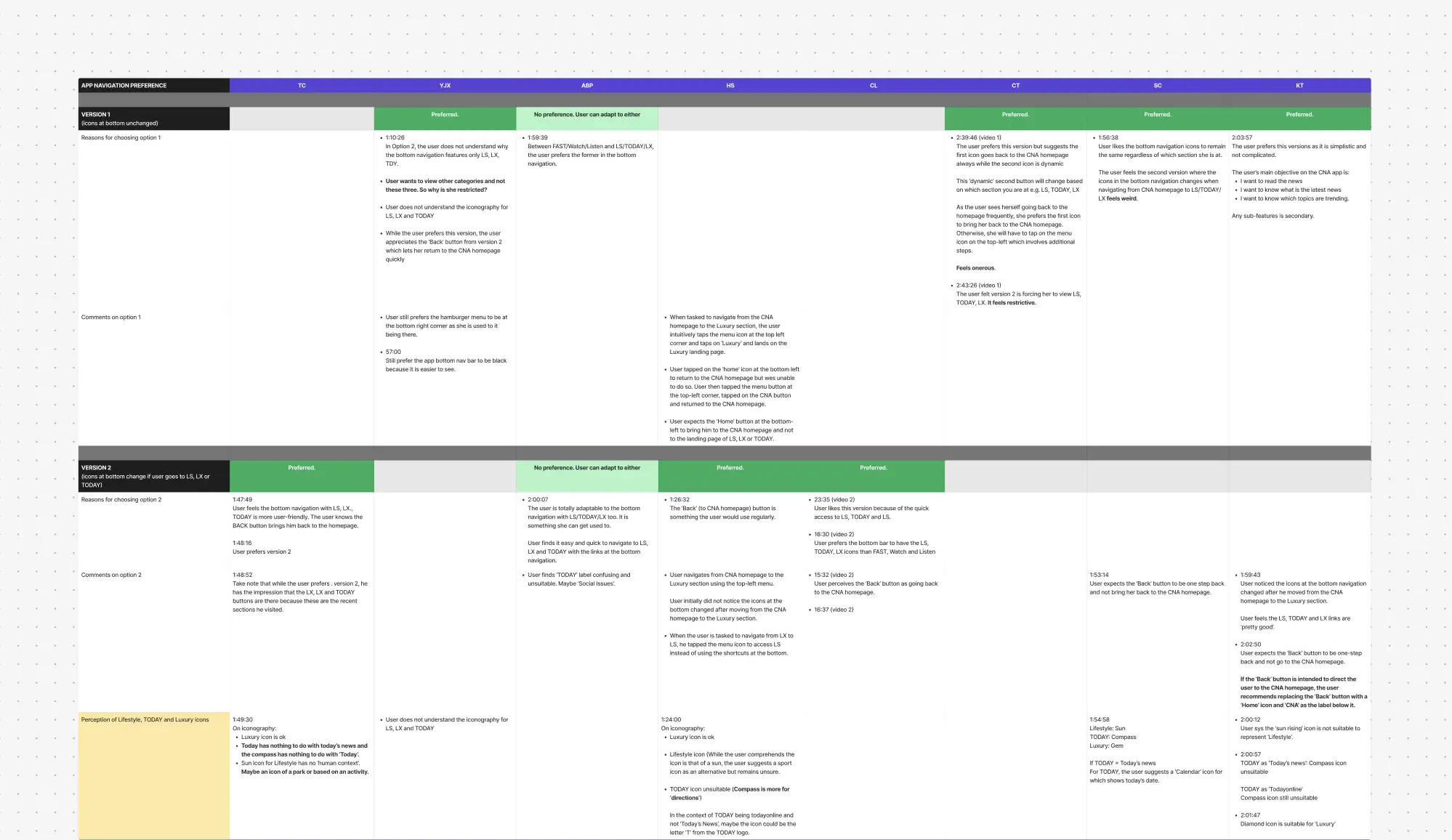
As a form of preference testing, we also asked users to compare two versions of menu designs as shown below. Eventually, we decided to go with Version 1 based on feedback from our users.
As a form of preference testing, we also asked users to compare two versions of menu designs as shown below. Eventually, we decided to go with Version 1 based on feedback from our users.
Version 1 (Chosen)
Version 2
Menu Version 1: Static Bottom Navbar
User uses the side hamburger menu to navigate between all sub-pages while the bottom navbar remains unchanged — Follows typical design conventions.
🗣️ Feedback: 63% of users preferred this design as the navbar behavior fits within their expectations and it is 'simpler' to understand.
Version 1 (Chosen)
Version 2
Menu 1: Static Bottom Navbar
User uses the side hamburger menu to navigate between all sub-pages while the bottom navbar remains unchanged — Follows typical design conventions.
🗣️ Feedback: 63% of users preferred this design as the navbar behavior fits within their expectations and it is 'simpler' to understand.
View Figma file: Usability Study Feedback
View Figma file: Usability Study Feedback
After conducting the study, we compiled and analyzed the user feedback for presentation to the product managers, taking note of the features we could improve.
After conducting the study, we compiled and analyzed the user feedback for presentation to the product managers, taking note of the features we could improve.
✅ Intuitive Menu
87% of users found the side menu position and icon intuitive, able to navigate pages without assistance.
87% of users found the side menu position and icon intuitive, able to navigate pages without assistance.
✅ Convenient Search
75% of users liked the search function within the menu as opposed to its existing position outside the menu.
75% of users liked the search function within the menu as opposed to its existing position outside the menu.
🤔 Confusing Icons
The Lifestyle and Luxury icons for menu Version 2 were confusing to users, but we ended up choosing Version 1 instead.
The Lifestyle and Luxury icons for menu Version 2 were confusing to users, but we ended up choosing Version 1 instead.
#5: Arrive at a final design!
#6: Let's reflect…
Finally, some hi-fi designs…
Finally, some hi-fi designs…
After iterating and tweaking the UI some more, I finally reached a high-fidelity design and prototype that was ready for dev hand-off.
After iterating and tweaking the UI some more, I finally reached a high-fidelity design and prototype that was ready for dev hand-off.
View Figma file: Hi-Fi Designs
View Figma file: Hi-Fi Designs
…and a final prototype!
…and a final prototype!
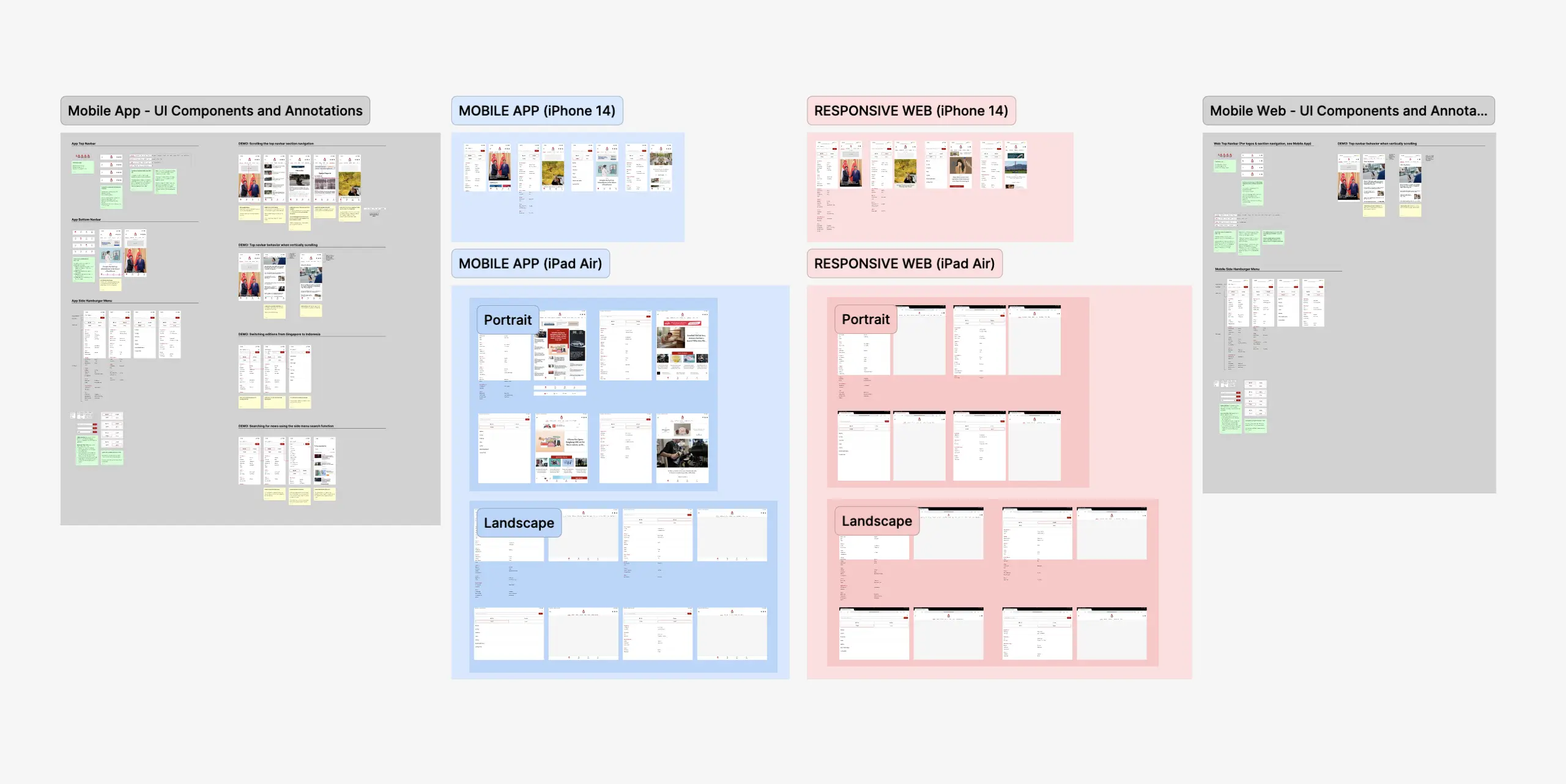
Adapting into web and tablet designs
Adapting into web and tablet designs
The mobile web designs were straightforward — the bottom navbar would just be removed in line with web conventions and its content would instead be found in the hamburger menu.
The mobile web designs were straightforward — the bottom navbar would just be removed in line with web conventions and its content would instead be found in the hamburger menu.
As for the tablet designs, it was relatively simple to adapt the menus for a wider screen size since there were no major changes. (For the below prototype, please take note that the mocked up home screens are screenshots from the current designs.)
As for the tablet designs, it was relatively simple to adapt the menus for a wider screen size since there were no major changes. (For the below prototype, please take note that the mocked up home screens are screenshots from the current designs.)
Preparing for developer hand-off
Preparing for developer hand-off
To prepare for dev hand-off, I also started on Figma component UI annotations for the developers, which were to be continued by the full-time UI Designer after my internship end date!
To prepare for dev hand-off, I also started on Figma component UI annotations for the developers, which were to be continued by the full-time UI Designer after my internship end date!
#6: Let's reflect…
Parting takeaways
Parting takeaways
It was especially exciting to undertake a UX Design internship where I was able to conduct more intensive user research and even plan and execute a usability study!
It was especially exciting to undertake a UX Design internship where I was able to conduct more intensive user research and even plan and execute a usability study!
I really enjoyed watching CNA users interact with my prototype as I was able to see how my designs would impact users in the real world — especially for such a popular news app like CNA. Going forward, I look forward to seeing how the revamp rolls out as an app user myself.
I really enjoyed watching CNA users interact with my prototype as I was able to see how my designs would impact users in the real world — especially for such a popular news app like CNA. Going forward, I look forward to seeing how the revamp rolls out as an app user myself.
Here were my main takeaways from this internship experience :)
Here were my main takeaways from this internship experience :)
🗃️ User research: the nitty-gritty
🗃️ User research: the nitty-gritty
A lot had to be done for the study such as calling participants to confirm availabilities and creating Calendlys to book slots. Some participants flaked on us and so we had to draw up contingency plans; this is the reality of research!
A lot had to be done for the study such as calling participants to confirm availabilities and creating Calendlys to book slots. Some participants flaked on us and so we had to draw up contingency plans; this is the reality of research!
🔀 Expect change and resistance
🔀 Expect change and resistance
Encountering questions and challenges to your design posed by product managers and users is to be expected. What matters is how you are able to explain your design rationale and execute any changes if necessary: be adaptable!
Encountering questions and challenges to your design posed by product managers and users is to be expected. What matters is how you are able to explain your design rationale and execute any changes if necessary: be adaptable!

Want to see more?
Check out more projects by me ⭐️