Creating icons for an internal KPI-tracking dashboard and design library
Creating icons for an internal KPI-tracking dashboard and design library
I contributed to Hyundai's internal design library by designing a set of icons for the company’s KPI-tracking dashboard.
I contributed to Hyundai's internal design library by designing a set of icons for the company’s KPI-tracking dashboard.
Sleek new icons for our component library
Sleek new icons for our component library
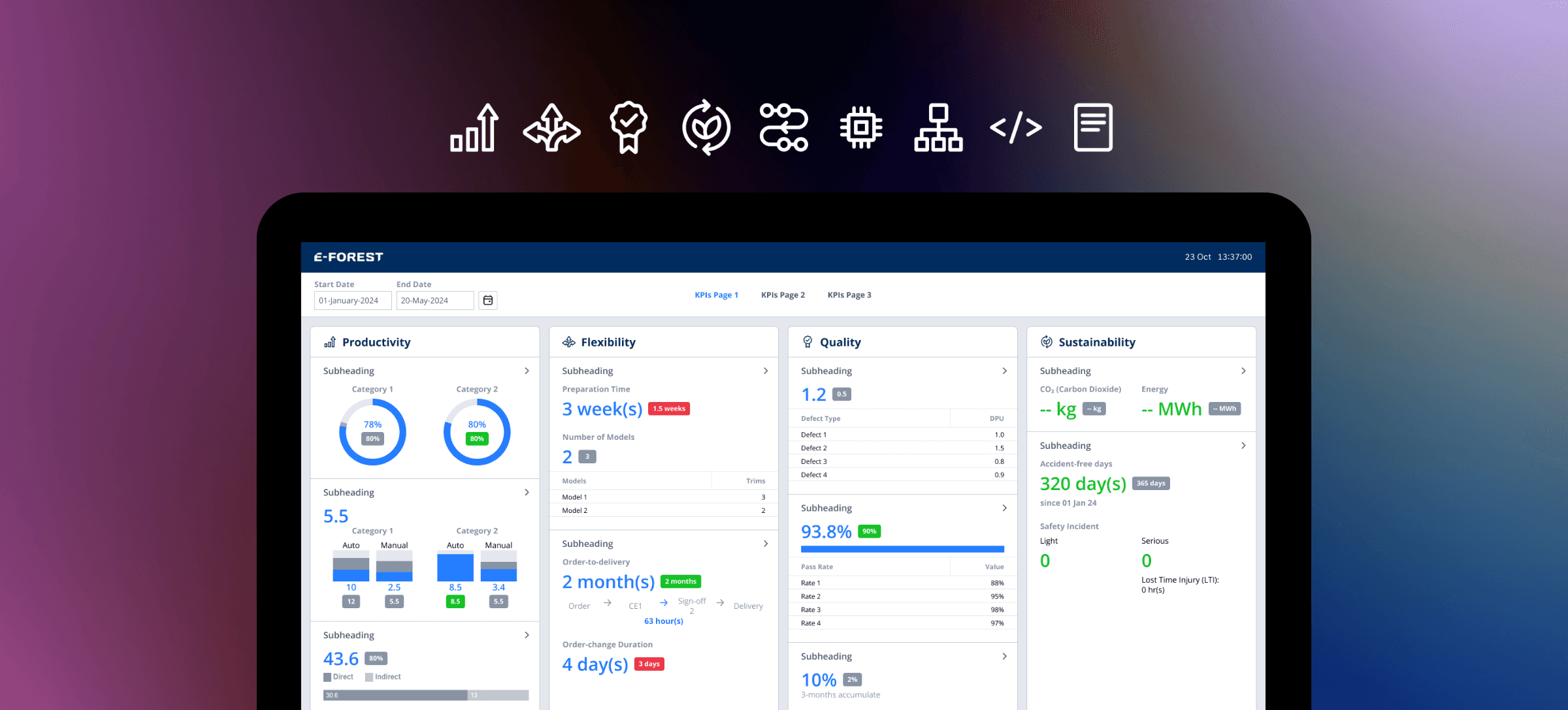
The dashboard tracks KPIs under nine categories: Productivity, Flexibility, Quality, Sustainability, Process, Technology, Organization, Development Status and IP (Intellectual Property).
The dashboard tracks KPIs under nine categories: Productivity, Flexibility, Quality, Sustainability, Process, Technology, Organization, Development Status and IP (Intellectual Property).
For this design task, I designed 24x24 px icons for each category, following the style of those in the existing design library. This improved design consistency with the other factory-related dashboards at Hyundai Motor Group Innovation Center Singapore.
For this design task, I designed 24x24 px icons for each category, following the style of those in the existing design library. This improved design consistency with the other factory-related dashboards at Hyundai Motor Group Innovation Center Singapore.
Duration
Duration
Jun 2024
Jun 2024
Skills
Skills
Iconography Design, Interface Design, Adobe Illustrator
Iconography Design, Interface Design, Adobe Illustrator
Team
Team
Individual UI Design task with support from my design mentor
Individual UI Design task with support from my design mentor
Gathering Design Inspiration
Gathering Design Inspiration
My design mentor recommended me to look at The Noun Project for icon design inspiration and how I could visually represent the nine categories. However, most of the icons there were larger than 24x24 px, so I had to take note that I could not portray of detail as shown in these references.
My design mentor recommended me to look at The Noun Project for icon design inspiration and how I could visually represent the nine categories. However, most of the icons there were larger than 24x24 px, so I had to take note that I could not portray of detail as shown in these references.

Iconography Design
Iconography Design
I used Adobe Illustrator and Figma to design the 24x24 icons. First, I used the Shape Builder, Polygon and Pen tools, enabling the snap to pixel grid feature to make the icons pixel-perfect and prevent fuzzy edges. Afterwards, I imported the SVG files to Figma to make further tweaks and refinements.
I used Adobe Illustrator and Figma to design the 24x24 icons. First, I used the Shape Builder, Polygon and Pen tools, enabling the snap to pixel grid feature to make the icons pixel-perfect and prevent fuzzy edges. Afterwards, I imported the SVG files to Figma to make further tweaks and refinements.
Throughout the process, I consulted my mentor to ensure each icon had an even visual weight and was understandable against the larger dashboard.
Throughout the process, I consulted my mentor to ensure each icon had an even visual weight and was understandable against the larger dashboard.

Finally, I added the final icon set into the design library as components, testing them out in the ‘Icon Test Area’ my mentor had created to check that they scale and change color properly.
Finally, I added the final icon set into the design library as components, testing them out in the ‘Icon Test Area’ my mentor had created to check that they scale and change color properly.

Parting Takeaways
As this was my first foray into iconography design, I had a few takeaways from this design challenge! It was fun to build my technical proficiency in Illustrator and Figma, focusing on the small details of the icons, since I normally work with larger wireframes.
As this was my first foray into iconography design, I had a few takeaways from this design challenge! It was fun to build my technical proficiency in Illustrator and Figma, focusing on the small details of the icons, since I normally work with larger wireframes.
👁️ Details, details!
👁️ Details, details!
It’s important to ensure that the icons have balanced visual weight, are readable true-to-size (24px) and convey the intended message.
It’s important to ensure that the icons have balanced visual weight, are readable true-to-size (24px) and convey the intended message.
📚 Libraries are hard work
📚 Libraries are hard work
Before, I often took design libraries for granted. Contributing icons to the library is a meticulous process to streamline all designs.
Before, I often took design libraries for granted. Contributing icons to the library is a meticulous process to streamline all designs.
🧪 Test icons as well!
🧪 Test icons as well!
Even after you create the icon, it should be tested for scalability, color changes and readability. The level of detail should consider the icon size.
Even after you create the icon, it should be tested for scalability, color changes and readability. The level of detail should consider the icon size.