Improving visual hierarchy and design consistency of an inspection dashboard
Improving visual hierarchy and design consistency of an inspection dashboard
I redesigned an inspection status dashboard to improve its visual hierarchy and consistency with the design library.
I redesigned an inspection status dashboard to improve its visual hierarchy and consistency with the design library.
A cleaner, sleeker dashboard for inspection engineers
A cleaner, sleeker dashboard for inspection engineers
The inspection dashboard provides engineers at Hyundai Motor Group Innovation Center Singapore with information to assess the condition of each cell.
The inspection dashboard provides engineers at Hyundai Motor Group Innovation Center Singapore with information to assess the condition of each cell.
In this UI design task, I focused on enhancing the visual hierarchy to improve usability while maintaining the existing content and UX. I also aligned the design with the existing design library components.
In this UI design task, I focused on enhancing the visual hierarchy to improve usability while maintaining the existing content and UX. I also aligned the design with the existing design library components.
Duration
Duration
Jun 2024
Jun 2024
Skills
Skills
Interface Design
Interface Design
Team
Team
Individual UI Design task with support from my design mentor
Individual UI Design task with support from my design mentor
Before: inefficient real estate and confusing buttons
Before: inefficient real estate and confusing buttons
Below is the dashboard before redesign. (Full-width screen size: 1980 x 1080)
Below is the dashboard before redesign. (Full-width screen size: 1980 x 1080)

What needed to change?
What needed to change?
❌ Poor affordance of the ‘Running’ status button — users did not realize it was a button, leading to unintentional clicks which prematurely stop the production process.
❌ Poor affordance of the ‘Running’ status button — users did not realize it was a button, leading to unintentional clicks which prematurely stop the production process.
❌ Inefficient use of screen real estate and too much white space.
❌ Inefficient use of screen real estate and too much white space.
After: better design hierarchy, consistency and affordances
After: better design hierarchy, consistency and affordances
Below is a mockup of the dashboard after the redesign to improve the overall visual hierarchy and optimize the screen real estate.
Below is a mockup of the dashboard after the redesign to improve the overall visual hierarchy and optimize the screen real estate.
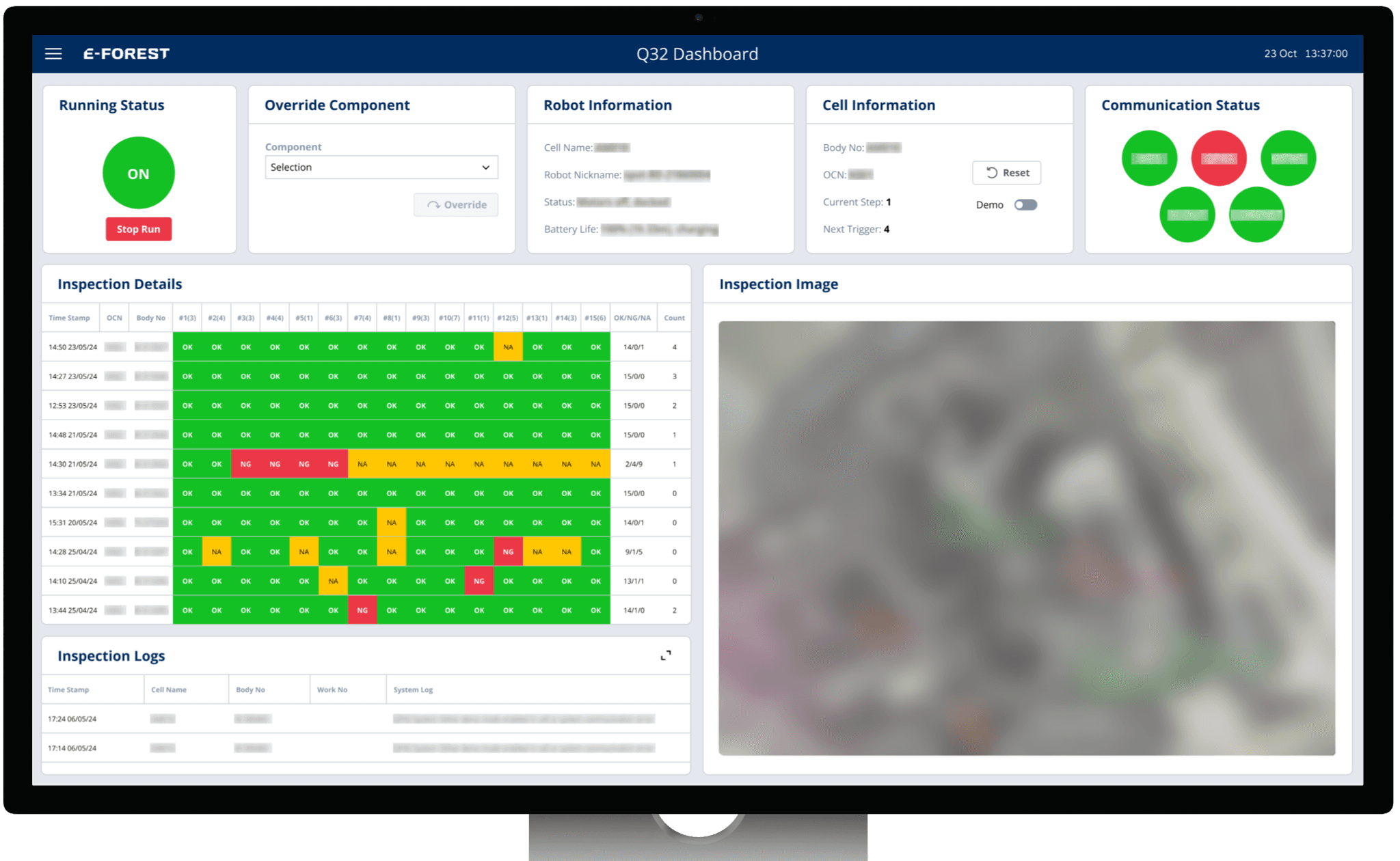
What was improved?
What was improved?
✅ Improved the affordances of the ‘Running Status’ button and ‘Override Component’ drop-down using existing button and drop-down components.
✅ Improved the affordances of the ‘Running Status’ button and ‘Override Component’ drop-down using existing button and drop-down components.
✅ Created a cleaner card-based layout to minimize unnecessary white space.
✅ Created a cleaner card-based layout to minimize unnecessary white space.